Saturday 17 August 2013

The Ten Commandments of Airbrush:
1. Learn to draw first, BEFORE you buy an airbrush.
2. Learn to paint and learn colour theory, BEFORE you buy an airbrush.
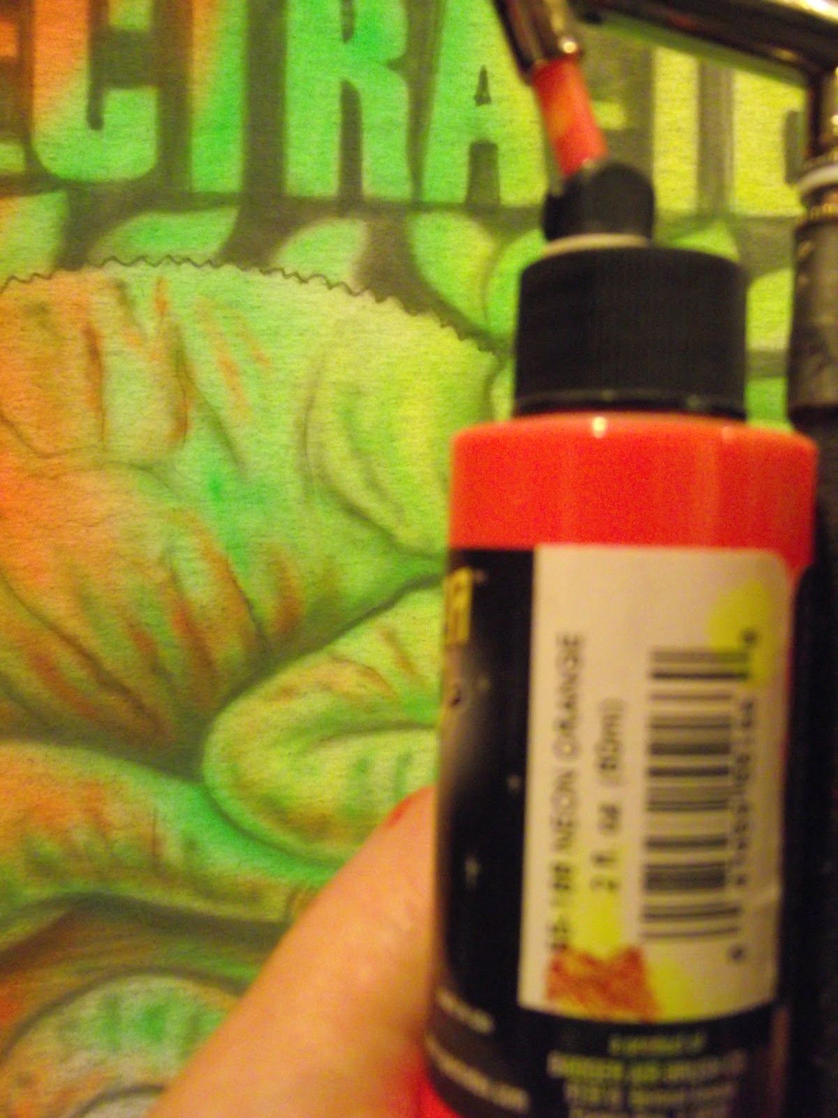
3. Your frustration that 'this airbrush doesn't work!' (usually on the 2nd day) is most probably caused by you not cleaning it properly.
4. Cliches are called cliches for a reason. If you use them and then wonder why you aren't changing the world?! Doh!! Choose the path less trodden.
5. Spend less time inventing a 'tagline' or 'gimmick' and more time earning one.
6. Build your reputation by 'building it' via good quality work and attitude, and NOT by belittling other artists and their work. Drop the EGO, we're all learning and NO-ONE knows everything.
7. One good quality airbrush is better than a bunch of 'cheapies'.
8. Thou shalt not foist thine artwork on 'friends' and 'family' - be aware that when you start out, people who love you will be 'nice' about your efforts. This isn't a real opinion, if you want that ask a professional, then don't cry when you don't like what they have to say. Learn from criticism - or you will NEVER improve!
9. Don't 'network' all of the time, no matter where you are. People quickly tire of the 'hard sell' everywhere they go.If your work is good, people will find you.
10. Your airbrush is not really an airbrush, it's a divining rod. Use it to find spirits in the other world and bring them over into ours.
11. (yeah I know) You have to know the rules BEFORE you can break them.
12. (see above about rulebreaking) - NEVER work for Free, No start-ups, No free samples, NO 'it'll be good for your portfolio'. Time is Money, don't give yours away for nothing. You're in the Art BUSINESS! not the art charity.

Thursday 9 May 2013

top ten airbrushing cliches

Top ten airbrushing cliches! - This is funny, they forgot a shirtless bodybuilder atop a mountain, holding a sword with lightning hitting the tip!

Monday 25 June 2012


These pics were taken outdoors in bright sunlight- the fluorescent quality of the Neon paint is subdued and appears somewhat washed out.You can however appreciate the sumptuous nature of the saturation..Spectra-Tex rocks!

Tuesday 20 March 2012

'Badger Spectra-tex Neon' Chameleon t-shirt

Just a quick one. This is a demonstration page of what the Spectra-tex Neon range of colours can do: This was a demo T-shirt for http://www.barwellbodyworks.co.uk/ they have recently become the uk dealer/distributor for the entire 'Badger' and 'Thayer and Chandler' airbrush range.
I am using the Badger spectra-tex 'Neon' range. These are a vibrant, funky airbush colours that have been developed specifically for textile painting, although they have a myriad of other applications.

I began by airbrushing a simple yet elegant chameleon onto a white 'fruit of the loom' t-shirt using badger ‘spectra-tex’ 55-179 – ‘True Blue’. I chose the chameleon as it’s nature most amazing animal. It changes colour to blend in with its environment. By choosing neon colours I have added an extra level of vibrancy and zest to it’s already iridescent appearance. Going from left to right, I began with 55- 165 - Neon Green, following the form of the tail, next up 55- 170 - Neon Wild Berry, blend softly into the green you have already added. You can also use some 55-169 Neon Purple for shadow areas in the pink section.

Then use 55-166 - Neon Orange, feather this out to the right as it will do a superb blend into 55- 164 - Neon Lemon. Finally using 55-146 – ‘Jet Black’ add some deep shadow to accentuate the form – DON’T use too much black as you will kill off the vibrancy you have created.

So a great beginner's project that brings a striking result simply by using the dynamic badger spectra-tex neon colour palatte.


Badger'-'Spectra-te
x' colours used are:(NEON FLUORESCENT COLOURS )
165 - Neon Green,
170 - Neon Wild Berry,
166 - Neon Orange,
164 - Neon Lemon
also (not- neon)
179 - True Blue and 146 - Jet Black

http://www.badgerairbrush.com/Spectratex.asp

Monday 6 February 2012

Part 2


For the yellow lettering, use staggered diagonal strokes to simulate a bronzey-brass effect with 55-154 'Metallic Gold'- Badger spectra-tex range.This will give the letters an added metallic shimmer which will breathe some life into them. Don't worry about being too accurate as we will shortly be going around the letters with black using the stencil again.
Like so...

Now replace the face stencil but this time using black carefully dust in black from the corners of the mouth, but DO NOT make it a solid black, subtlety is the essence here...
The same with the hands, but by replacing the stencil and going around the OUTSIDE this time we are effectively creating the negative space that gives the hand some form.
after the black and yellow use 55-169 'Neon purple'- (Badger spectra-tex range) on the eyelids and on the reflected section of the hair. Rather than a solid black create a texture that is a bit like marble that adds contrast to the organic form of the visage.

Go over the black towards the end of the process with Opaque Black (55-146 'Jet Black'- Badger spectra-tex range). This will tidy up the edges left by the other colours used so far.
Finished!